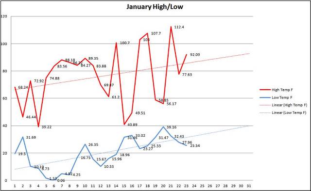
Here's the greenhouse temp. graph from January. I crunched the data a few days ago so I'm missing the 25th and 26th.
I have 144 temp. readings for each day (10 minute intervals). I then extract the high and low out of the 144 readings and plot.
Wish I had a sensor on the outside of the GH so I could add a 3rd set of data on the graph to compare inside vs. outside...maybe after the auto. sides project.
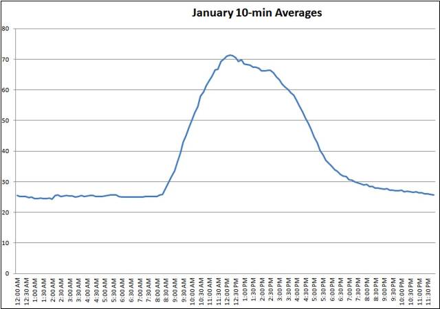
Just for fun, here are the 10-minute averages for January. I took all readings from the same time in Jan and produced an average then plotted. Plotting 12 lines on this graph would be cool to track the sunrise/set over the course of the year...
And yes, my wife says I officially lost it; but she just doesn't understand

Its fun when education, hobbies and work all collide.